Umbra Abra, "Kudzu"
A cover design case study
11/1/24
Tagged with
It took me a long time to get comfortable with the fact that no two projects ever get made the same way. I gradually had to associate each project more with a relationship, between me and my collaborator, more than any set of “best practices”. One of the most instructive working relationships was with Umbra Abra, a DJ and techno producer I’ve become good friends with over the last four years.
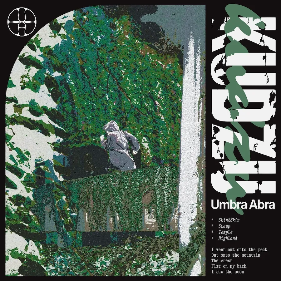
My favorite collaboration so far we made for her release, “Kudzu”, for which I’ve done more rewarding iterations than any other album art project. I loved this project from the very first draft, which is rare for me—usually I have to work through ugliness until the very last second (a process that has stressed some clients out before).
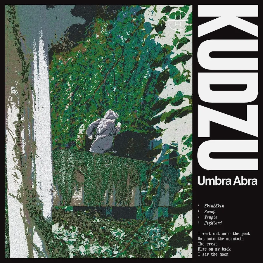
Umbra and I talked about the concepts and feeling before any sketches. The name “Kudzu” was locked in, so I started the whiteboarding there. I spent some time in North Carolina previously, so I had some very strong associations with the word. I thought about gas stations being swallowed whole over the course of a single summer, of abandoned cars becoming lost ruins, wrapped up in this furiously sleepless green. If you haven’t spent much time in the American South, it’s worth a visit. Things fall apart and decay there in a unique way. The history of the region, lest I have to spell it out, adds to that somber effect.
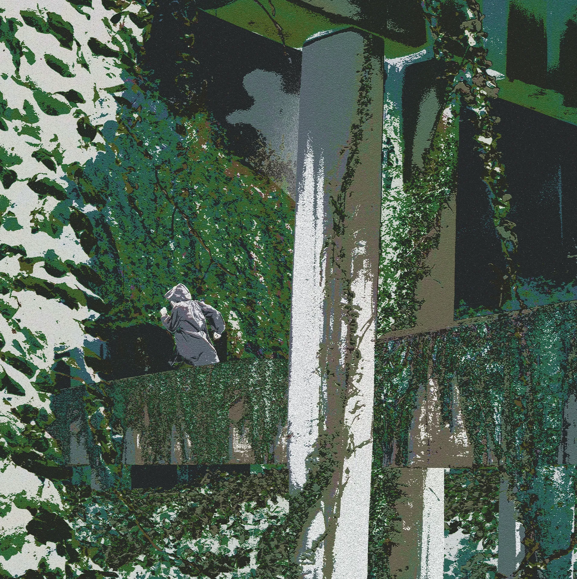
Thinking of that, more than the music (as good as it is), I wanted to make something haunted. It’s all built on this collage I put together from a bunch of stock photo elements, brought together to frame this lone figure rushing urgently across some strange, vague, rotting infrastructure. Kudzu chases verticality with ease, so I built a scene that could be chased by the vines in a dramatic way, and be easily framed or cropped into a square.
I needed a way of unifying the collage, because the fidelity, exposure, etc. of each image was different, and I’m not the best collage artist. One approach I took was to break the image up into six groups based on their lightness, not unlike the Posterize effect, assign each “band” a single color, and offsetting them to give it an offset-printing effect that roughens the whole thing in a fun way.
After this was designed, I experimented with different framing treatments within which to keep the text. These are some iterations I kept:
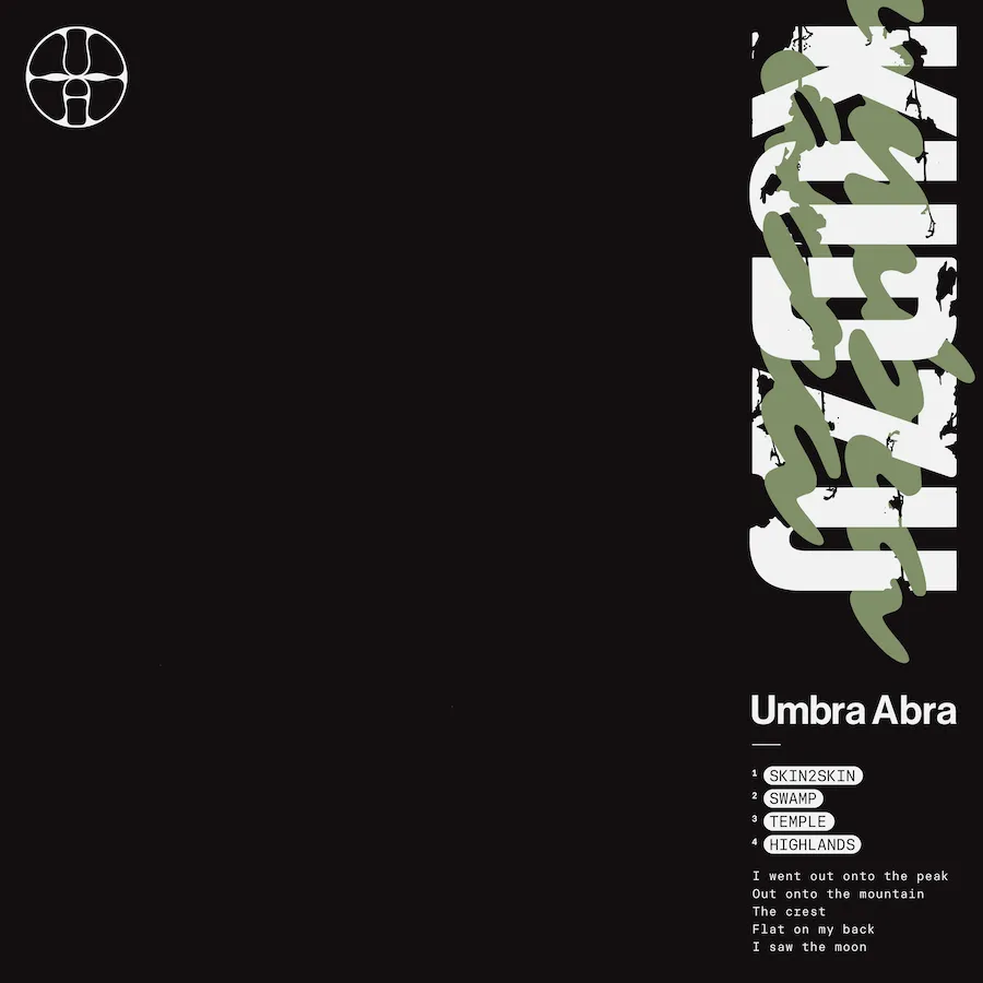
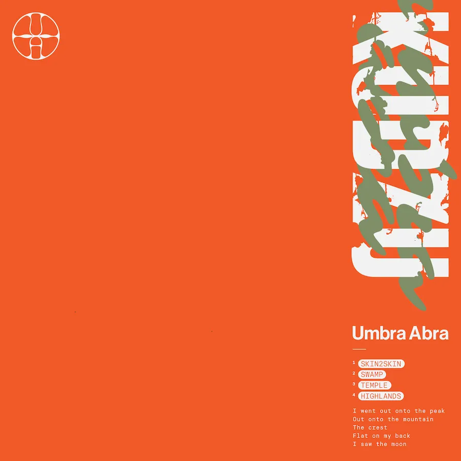
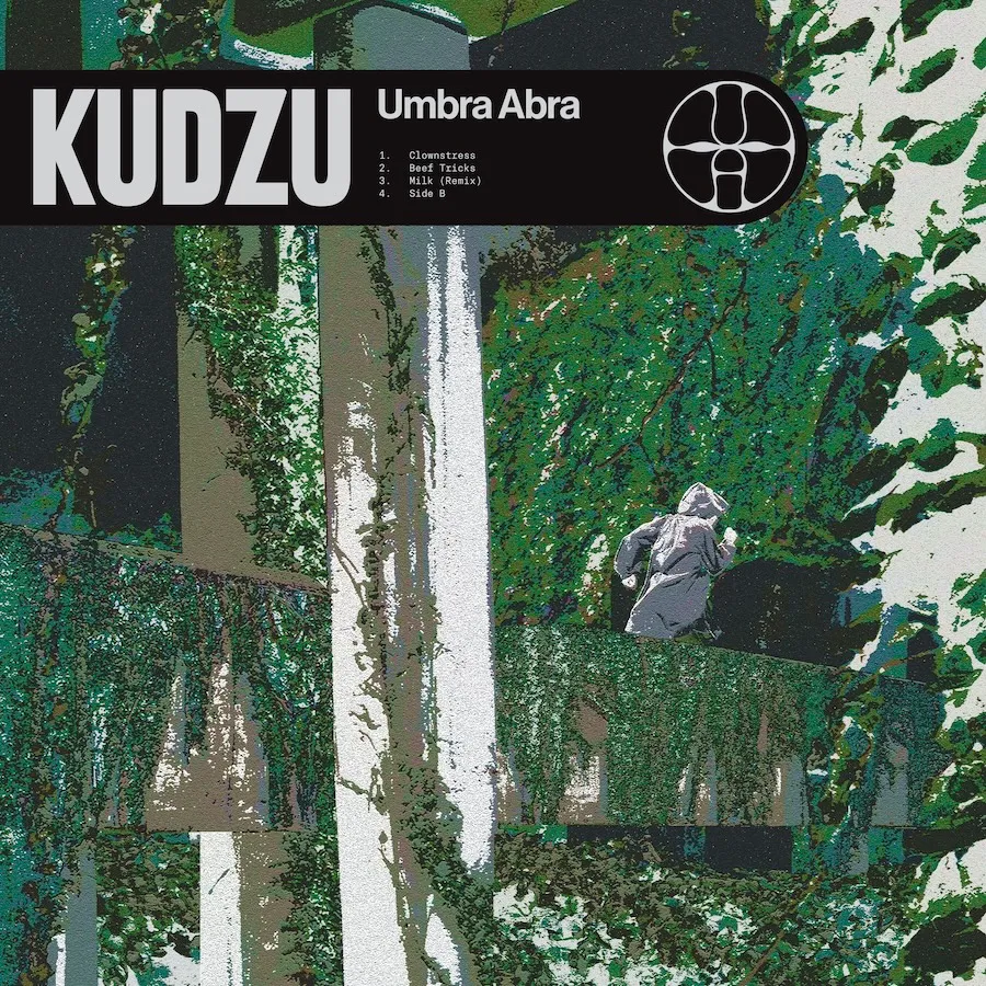
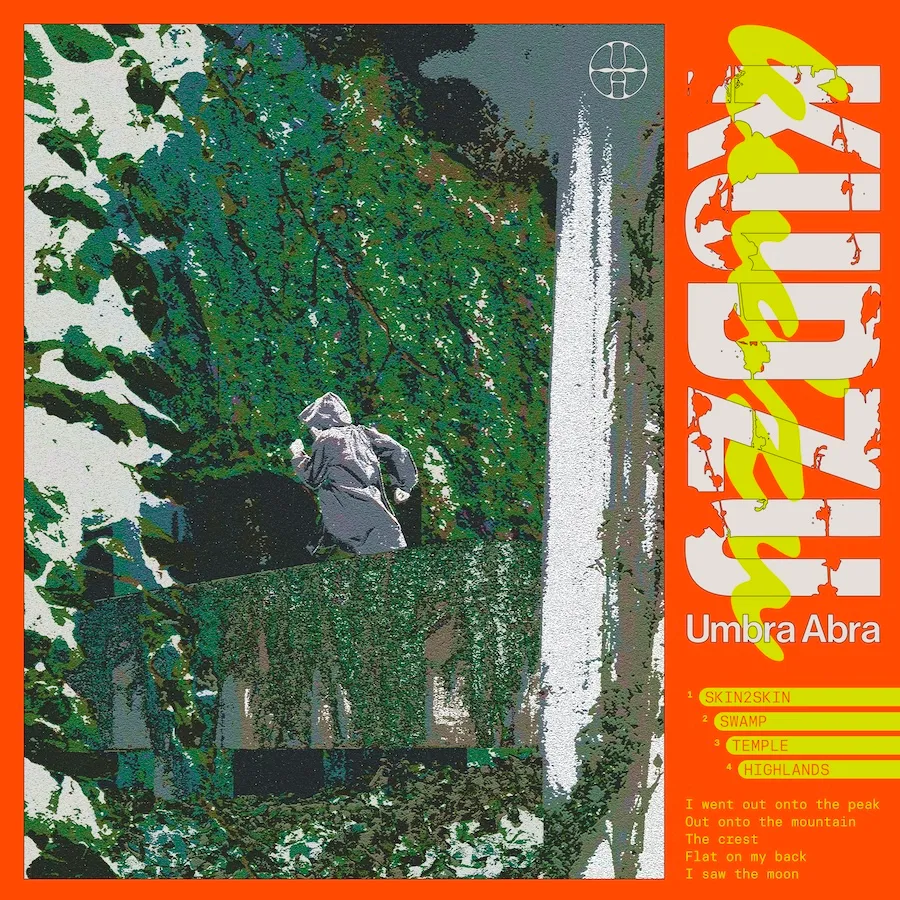
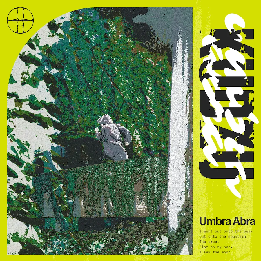
We joked about Four Loko, about heaviness, jetskis. Some of these were better than others, all of them made me laugh in some way. Ultimately, Umbra made the final call that we should go with this:
I’m pleased with the result, but there’s another life where I push for the use of the sole initial collage, without any type. That part of the process felt the most honest to me. When it comes to setting display type, I think I default to trends too quickly, or force text into a certain orientation or scale just because the space is there. It’s a habit I’m trying to get out of.