Living Future Rebrand
Scrappy, resource-minded rebrand for a maturing environmental nonprofit
5/1/25
Tagged with
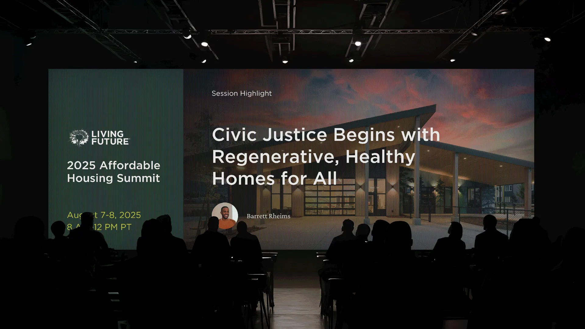
During my tenure as the in-house designer for environmental nonprofit Living Future, I led the graphic identity component of our in-house brand refresh, meant to coincide with a name change update. The refresh touched all aspects of our brand: from the social media presence, documents and grant reports, and marketing photography, built from thoughtfully selected colors, typography, and templates.
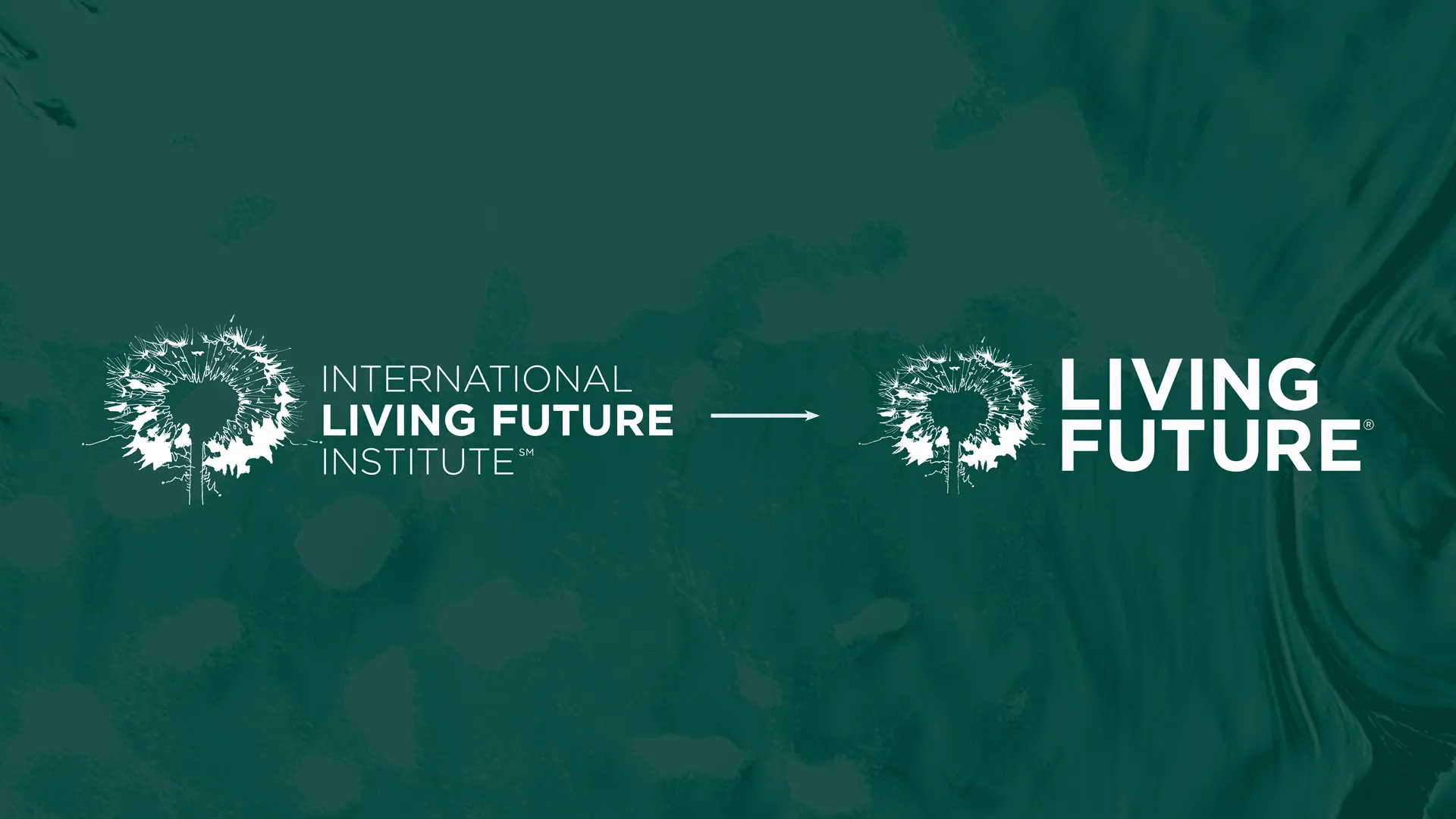
We were subject to some notable budgetary and strategic constraints: we couldn’t hire any design contractors, nor could we alter the base logo in any way. The company was stretched thin between 6–10 lines of business (depending on how you counted), with each having its own set of legacy assets, meaning too that our iterative updates to the brand would have to take into consideration the fact that over a decade of collateral was going to have to coexist with the new direction.
I suggested a conservative, streamlined approach to our suite of assets: take what’s good, formalize its application, and chuck the rest, making sure that the remaining colors, fonts, and logos are all rebalanced in accordance with the new identity.
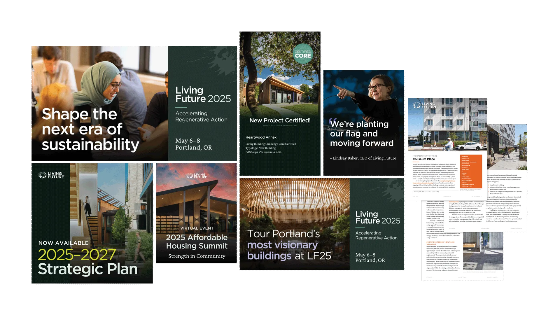
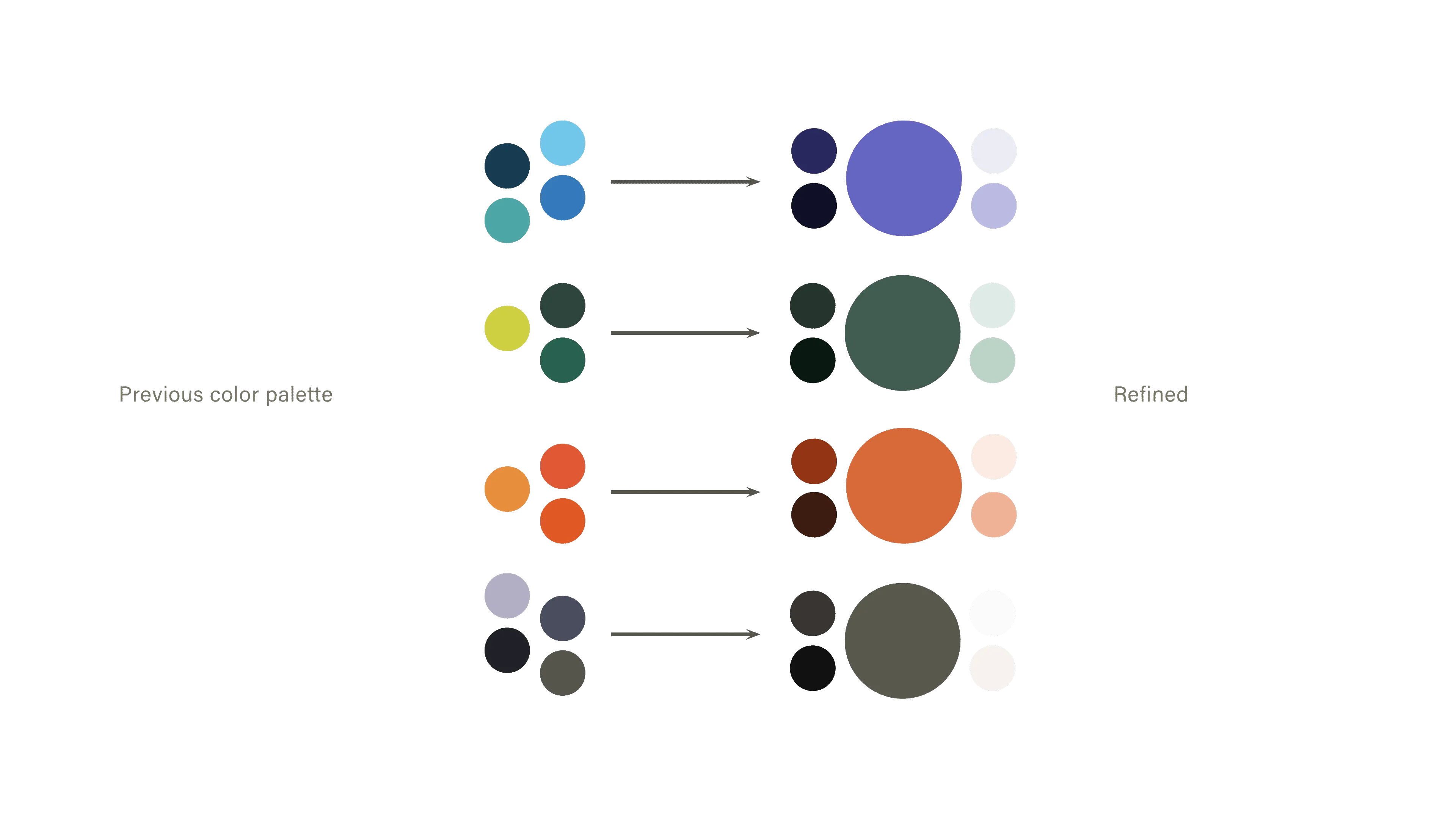
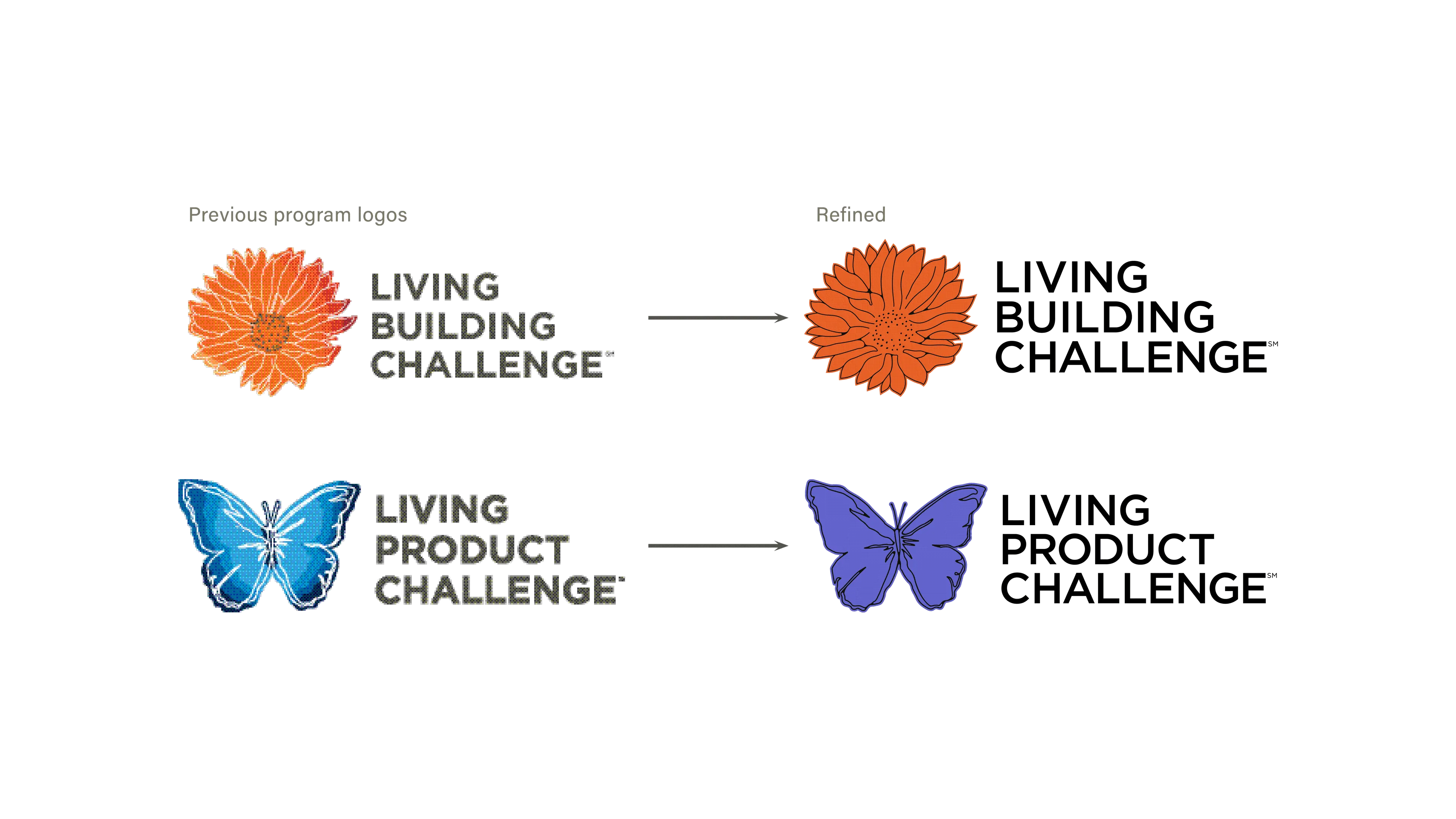
We had a palette of over ten colors, which I brought down to four “bands” of tonal hues. We had one typeface, which I expanded to two, formalizing the use of each into a hierarchy that was warmly technical and readable. We have over a dozen logos, which I revisited and balanced according to the new typographic scheme, and flattening any which involved color gradients into something simpler and more pleasing.
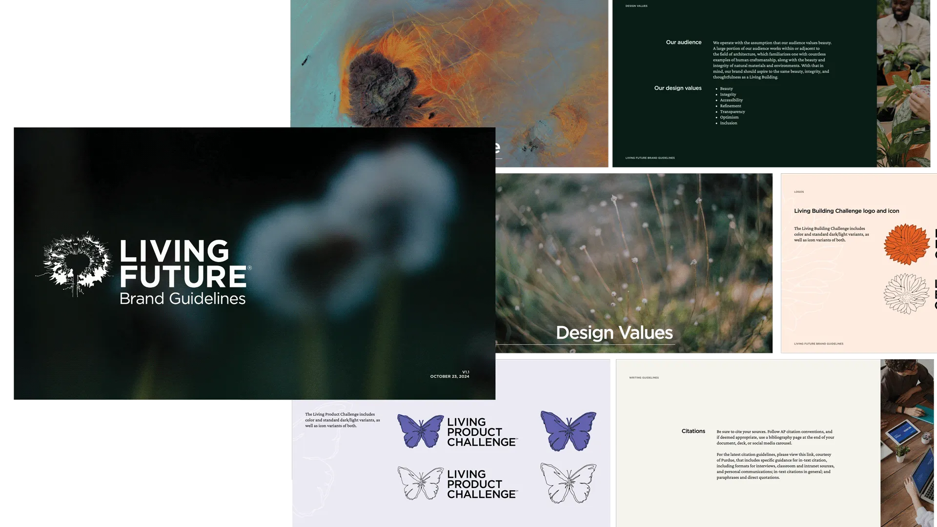
The sum effect was a “new” brand built from the old one. The new brand is streamlined and measured, summing the broad lines of business into a single emotional conclusion: that Living Future is a warm, maturing institution, with the integrity necessary to make real a regenerative future.